a Year of Pandemic…
1.data
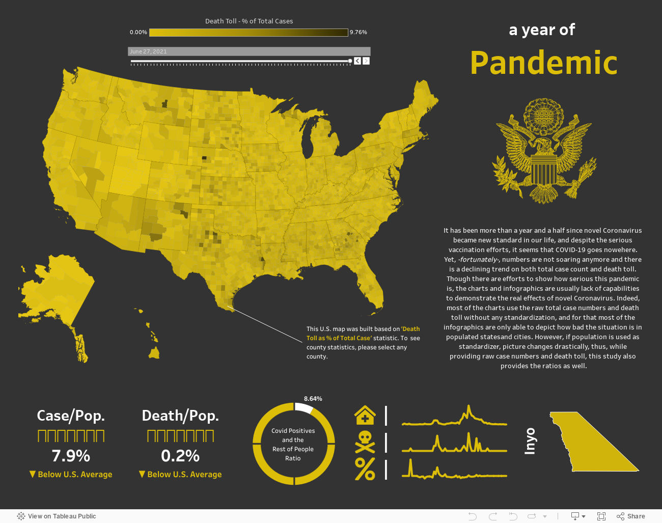
COVID data is available all over internet, and you can get it from different resources. However while some of the available data sets are only state-wise, and some of them are time limited. That’s why after a long search, I found this data set on github. It has around 1.6 million rows and it is clearly very extensive data. However, there are discrepancies on it. This data has a weird spike on May 2020 and I couldn’t verify it, it must be either change on sourcing or change on recording technique. Anyways, it’s not suitable for an historical analysis of death toll and total cases with bar chart or line chart. That’s why I decided to keep the data and not to do a historical chart.
2.story
COVID19 had a huge impact on our lives and it’s still effecting it. While I was building this dashboard, numbers were declining and I thought we were getting closer to end of it. Yet, with the rise of delta variant, numbers are soaring now and things are not going good in U.S. as of 1st of August, 2021. However, it was not my intention to show if it is getting worse or ending. My main goal was trying to show some different perspective on standard charts. Because most of the available reports and charts were build on raw death toll and total case numbers, thus, states like California, Texas or Florida, -states have highest population in the country-, lead all those graphs. Yet if we add population to these figures, U.S. map starts to show some other stories, and it was my intention to do.
3.tips
When we work with U.S. map, Alaska and Hawaii always give us headache due to distance of these lands to homeland. Also what we know is the map in Tableau is not totally accurate to show real map (though there is no hundred percent accurate one). For that I really suggest to use ‘Lambert Conformal Conic Projection’ instead of default table in Tableau. Here in this dashboard I’ve used it and isn’t it better? It should be noted that this dashboard was filtering on hover at first, but when you have millions of rows, this might be glitchy due to tons of filters on every hover. That’s why I stopped filtering on hover, instead I’ve turned on filtering on select.