Detailed Analysis of Info We Trust
1.data
This data was a MakeOverMonday event data, and I got it from data.world. Data is based on RJ Andrews’ Info We trust, and basically it’s the count of words in each section, each chapter and all book. With this info lots of information can be gathered and many analysis can be done. I thought, a sunburst chart would be very good for analysis, since sunburst chart is very good fit for data with many sections and subsections. But there is no built-in sunburst chart in Tableau and I had to built it. And for sunburst chart, you have to prepare your data in a strict pivot shape. If you have a massive data, this might be a little challenging but still worth to do. However, TF-IDF analysis is the real pain and you have to do more data preparation for that
2.story
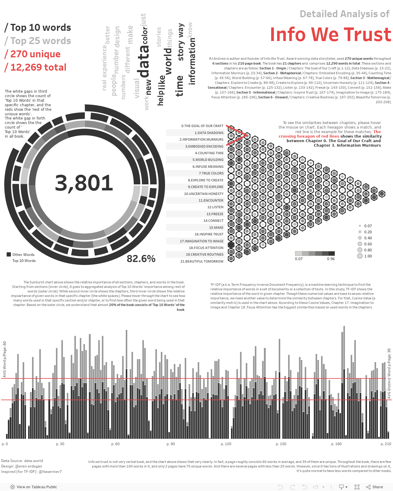
I always like word analysis. I believe what we pick to express ourselves shows our personality, and it’s not different for any text. Though it’s a data book and not a big surprise to see that ‘data’ is the most common word all around the book, yet it’s very surprising that this book has only 270 unique words and top 10 of these 270 words makes the 1/5 of all book. Isn’t it fascinating? And what we can see from the bar chart is more exciting to me, a page has 60 words on average and only 39 distinct words! So, the case of this book clearly shows that if you know what you are doing and if you have enough visual item, you don’t need too many words to express yourself.
3.tips
When we create charts, that stacking option in Tableau is always turn on by default. For many data enthusiast it’s ok to have stacked data but for me I don’t like stacking for two reasons: first if you stacked the data and if you don’t hover the cursor for tooltips, it’s always hard to read the values on this type charts since one of the chart doesn’t start from starting point (usually zero(0)) and you have to basic subtract for values; and last but not least, stacked charts are not that handy the real difference between two bars. Therefore, when I use bar charts in these of situations, I turn off stacking and put them in a chart with different colors. With this technique, I can always see the values of bars (unless they are not consistently overlapping) and the real difference. Another useful technique that I’m gonna suggest is adding another circle manually for sunburst chart. This outer shell in our case, helps to see the bigger picture. Though it’s possible to add this outer shell automatically by adding another column to data as “others and another”, but this approach effects the data normality and almost no need for this. Instead, you can create this circle as a measure and make background transparent, and finally place your real sunburst chart in the middle of it.